
This is Why Your Website Needs to be Mobile Friendly
 "This is Why Your Website Needs to be Mobile Friendly")
When Website designers approach creating a website, they do the work from behind the giant screens of their desktop computers or even laptops. When they show it to you, you scroll through at your desk and are impressed by how beautiful it looks. You're a very happy with the results, so you pay them their fee and go on your way!
If that scenario sounds familiar, it means you've forgotten about a very important factor in website design: your mobile site. Creating a website that is mobile friendly is more important than ever before, and so if you haven't checked your site's mobile layout and performance recently, it's time to do so.
Below, we're going to discuss why it is a must that your website be mobile friendly, and what you can do to make sure you're providing users with the best possible mobile experience on your site.
Your Website Needs to be Ready to be Viewed Where the Users Are
In Canada Nearly 50 percent of all website traffic is coming from mobile/tablets according to a recent report from Statista. You created your website for prospects and customers to use. And the fact of the matter is that, today, a lot searches are originating on mobile devices, not desktop computers.
If your site isn't mobile friendly, the majority of people coming across your website might be experiencing slow load times, small display that you have to pinch your screen to expand, a jumbled layout with hard to see navigation or missing information. None of these issues make for a great first impression, which can lead to your visitors getting frustrated and leaving your website for your competitors. So you need to clean up your mobile site so that users are instead finding information about your business quickly and easily.
Mobile is Preferred by Google
In 2018, Google announced that they would begin to rank search results based on mobile, rather than desktop, sites. This decision was driven by the fact that most users are searching on mobile devices, and so Google wants to ensure that the results they're displaying first are going to be high quality and really meet the needs of the majority of searchers.
If your site is not ranking well on Google, that is a serious concern. Google is the number one search engine, and if you're not showing up on their first page of results, it's likely you're not being seen at all. According to Moz, the first page of Google captures 71% of search traffic clicks and has been reported to be as high as 92% in recent years. Second-page results are far from a close second coming in at below 6% of all website clicks. So if you're on the second page, you're only getting noticed by about 6 percent of the people who might need your goods or services. Learn more here about Google's search intent and SEO.
Improve Your Site for Mobile
Now that you understand why mobile is so important, what can you do to make sure your site is hitting the right marks?
Take a Look for Your Website
The first step is to see where you stand right now. Pick up your phone and go to your business's website. Does it take a long time to load? Once it's up and running is everything laid out properly? Are there elements that don't load? Are things overlapping? Is the type too small to read?
Reach out to your friend's and family and ask them to check out your site. What do they notice? Do they find it easy to learn what you do and how to contact you? If you or your friends find any issues with the site, then you've got work to do.
Website Loading Speed is Important, Check Your Speed
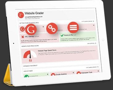
Now that you've experienced your website from a mobile device, you'll want to get a formal score for your page load speed. That's where Google PageSpeed Insights comes in. Google will give you a separate score for both your mobile and desktop sites. If you're not getting a green light on both, you need to contact a developer to work on increasing the speed.
Usually increasing load speed on mobile is a pretty easy fix for a professional developer. Sometimes it's big, bulky files that are slowing you down such as large images in your content. Other times, your site is designed on an old, out of date theme. Whatever the issue, a pro can usually diagnose and solve it quickly.
Eliminate Unfriendly Elements in the Website Coding
Some things, like JavaScript and CSS images, do not load well on mobile. You should eliminate those elements from your website and instead replace them with simple images and blocks of text.
You'll also want to think about using responsive design and selecting a font size that's legible without zooming in. Not only are these elements important for user experience, they'll affect how you rank on Google.
Similarly, you'll want to be sure that content is not hidden in images or other types of files that Google cannot crawl. When Google decides how to rank sites for certain search terms, they're looking for those keywords on your site. If the keywords are tied up in images rather than simple text, Google isn't able to see that your site has relevant information. For more on best practices for ranking on Google, check out this article.
Having a mobile friendly website is critical in terms of serving your audience and getting found on Google. If you haven't thought about your mobile site in a while, or have been meaning to update in for years, now is the time to take action! A few simple changes can make a huge difference in your Google ranking and the experience for your users.
Bloomtools Websites are designed with Website Standards incorporated into our platform and every website. When a Bloomtools website is found, it loads fast and is designed by our team of experts to ensure that the website visitor can easily navigate their way through the site to find what they are looking for, no matter what device they are using. Get in touch with one of our Bloomtools representatives today for a free consultation.
| Tags:Web DevelopmentWebsite PerformanceNews |

 "The 5 Digital Marketing Channels Most Canadian SMBs Should Focus On (and Why)")
 "Your Website Is Not a Brochure: Building Digital Systems That Sell for You")
 "What a “Medium-Sized Agency Advantage” Actually Means (And Why It Matters)")
